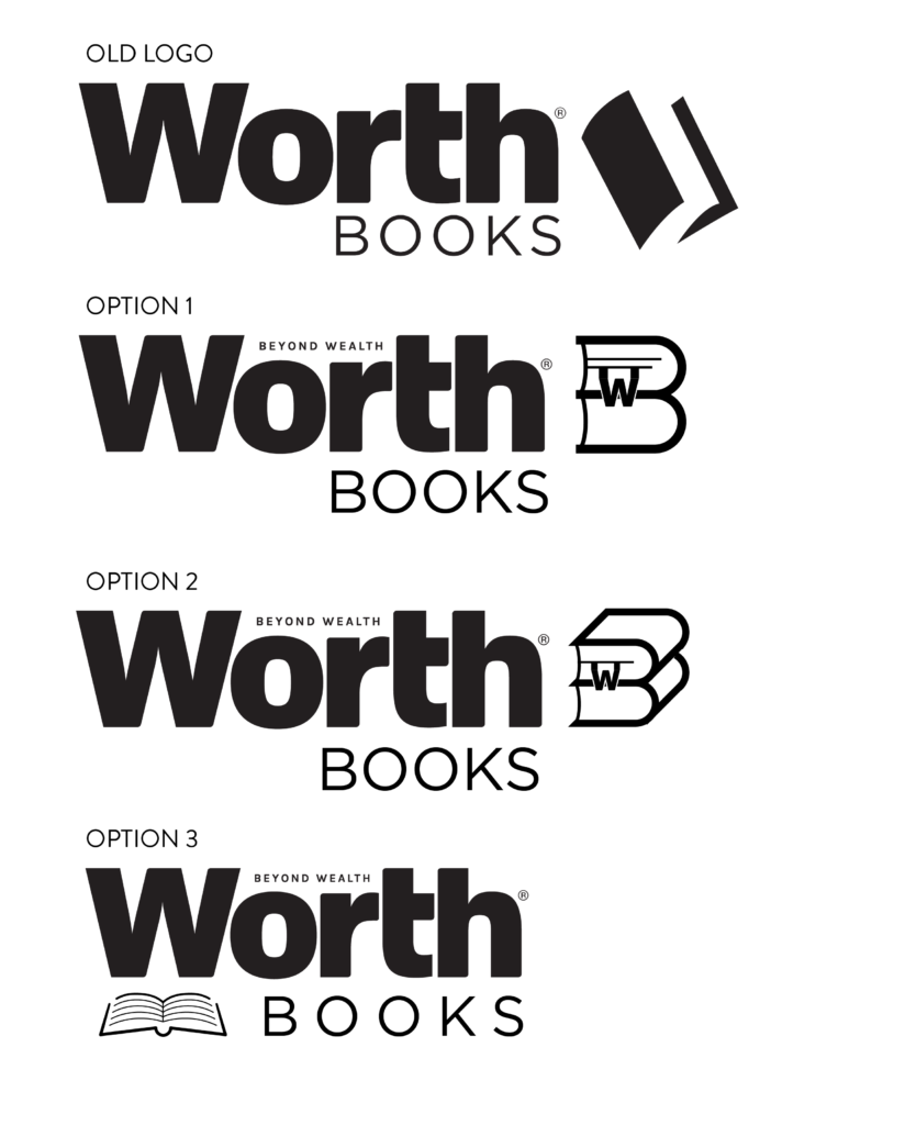
In preparation for the print ads in the upcoming Worth magazine issue, I was asked to redesign the Worth Books logo. The old logo was too basic, and read more as a standard stock art icon than a professional logo.
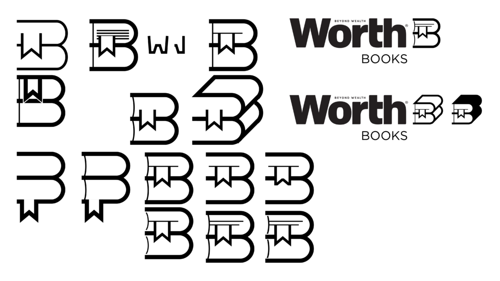
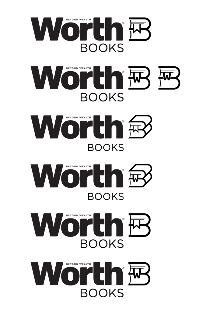
I started by doing some design research to see what other book logos were out there to see if I could draw inspiration from any of them. I then started thinking about what I wanted this logo to be, and what I wanted to accomplish with it. I thought it would be fun to incorporate the Worth “W” as well as the “B” from Books. I realized that a stack of two books seen from their top caused the covers to look like the letter B, so I rolled with that. I tried variations looking straight on, and some at an angle, so you could see the rest of the cover, helping to reinforce that you were looking at a stack of books.
For incorporating the “W” from the Worth logo, I initially wanted to put it on the cover of a book, but realized that was too obvious. In my design research, and saw a few images of books with ribbon bookmarks that came to two points on the end. When those bookmarks drooped down, the outline created a “W” shape. From there, I started testing out various ways to turn that Worth “W” into a bookmark.
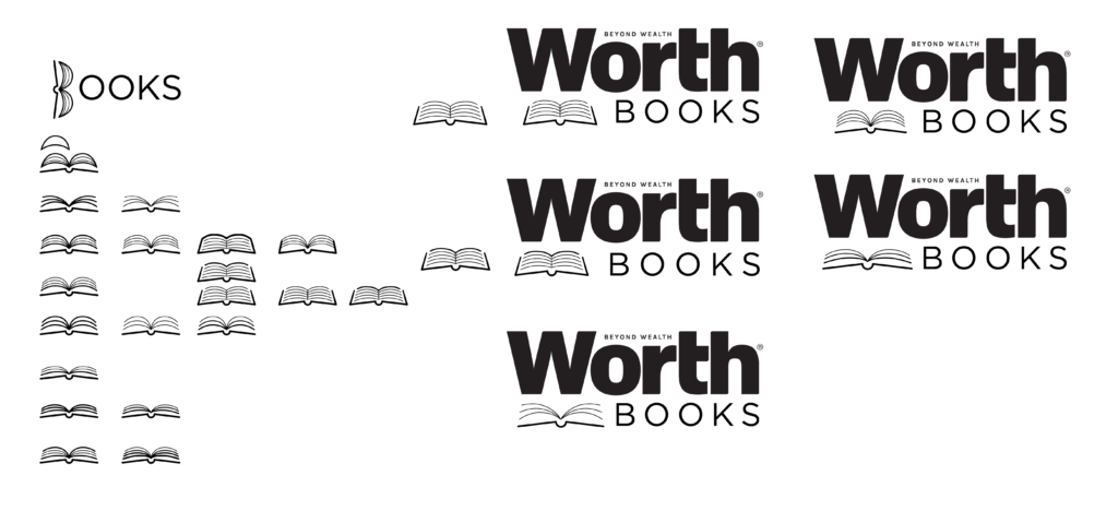
After showing my boss my progress, he requested I create an additional design that was a major visual departure from the designs I had been working on up until that point. This time, instead of incorporating elements into the logomark, I decided to just create a visually interesting book icon. I started playing around with simplified line art of the book, using line weight variations to distinguish between pages and the cover.
When I presented my final design option to my boss, he picked the third option with the line art book icon. He liked the simplicity, and how it differentiated itself from the old logo by not having the icon off to the side of the wordmark, having everything centered below the Worth logo.


