The Challenge:
Refresh my personal brand design to more accurately reflect myself as a designer.
The Process:
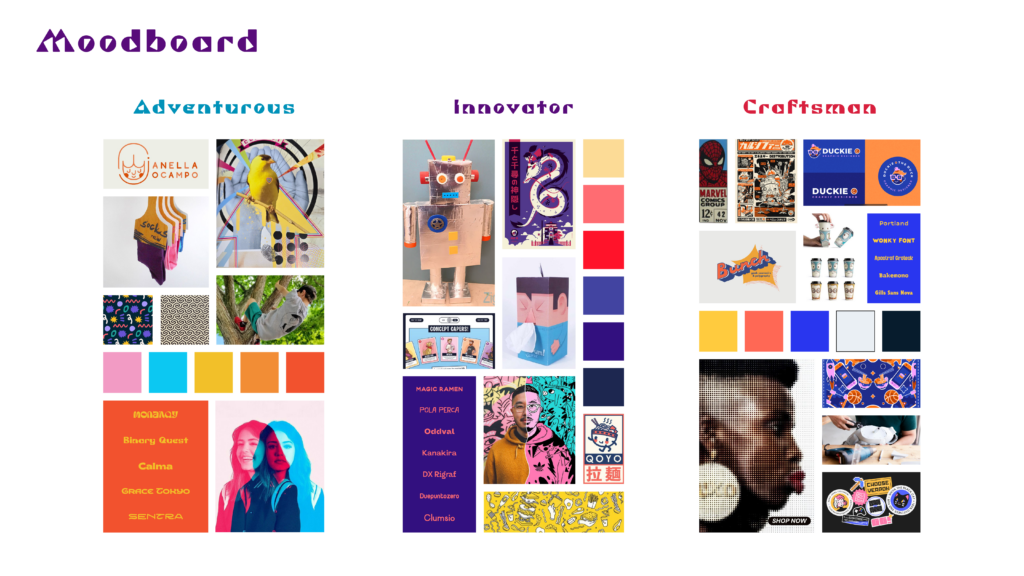
I started by creating a web of words that I felt applied to my style and sense as a designer, then categorized them into 3 values. From there, I took one word from each category to form basic identities that applied to me. I did that several times, and then picked out three and used them as a basis for the moodboard, then selected images that I felt applied to each category.
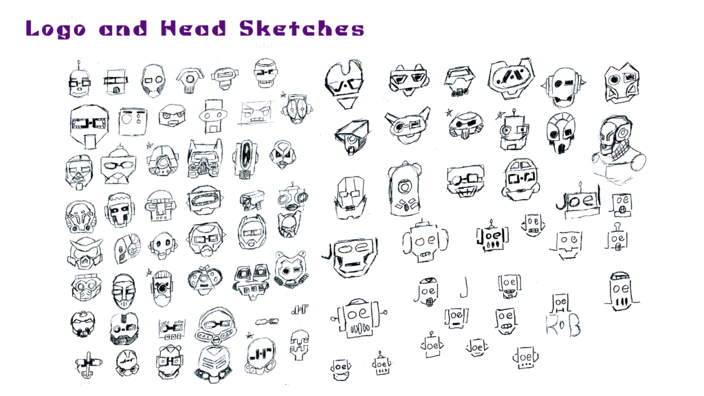
From the moodboard, I really honed in on the recycled cardboard robot. Making those is my first creative memory, and what I believe sparked my love for making and designing. As such, I decided to base the refresh around this concept. I started sketching a bunch of robot heads for possible logo designs, just basically mashing different shapes together to see what created interesting forms.
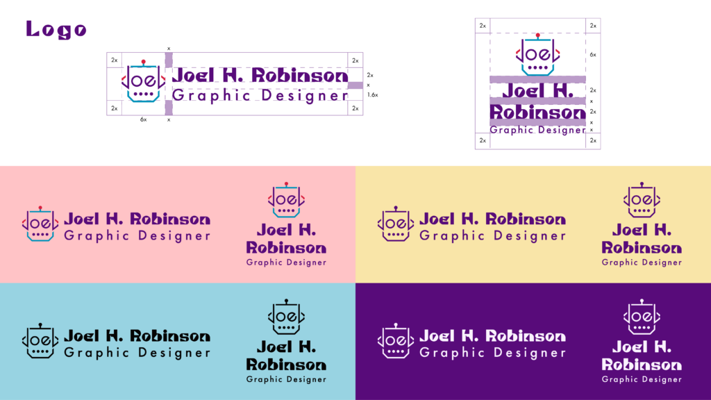
As that progressed, I started to try incorporating my initials or my name into the design, as all my previous logo designs included my initials, and I wanted to pay homage to that. I eventually made some designs the included my name in the head of a robot, and decided to move forward with that as the main logo.
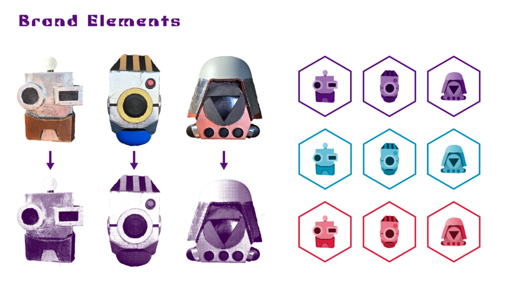
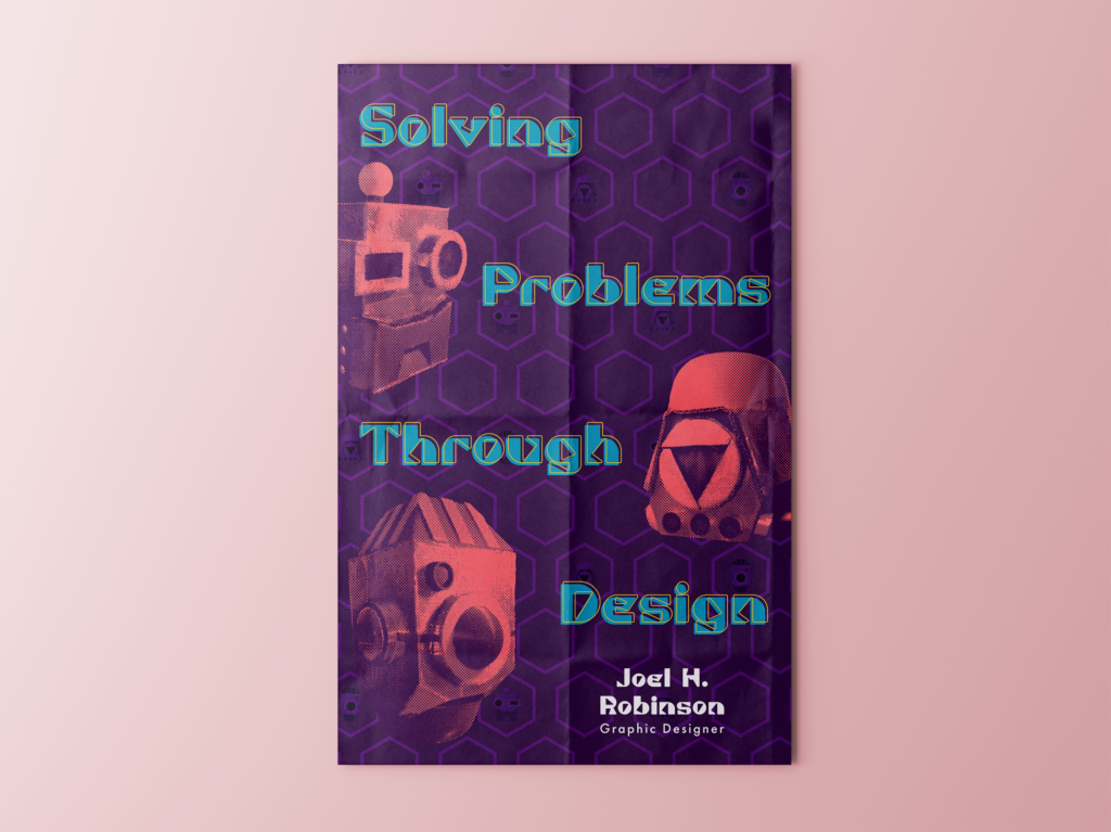
However, I really liked some of the regular robot heads I designed, and so I had the idea to use them as separate brand elements. I picked out three that I liked best, and decided to actually construct them using recycling that I had lying around. It was all done freehand using my sketches as reference, and I really loved the process of figuring out the best way to construct each piece, and what material to use.
I felt that just using the robot heads as-is didn’t give the right feel, and so I applied a halftone and duotone photo treatment to each to complete the look. This will allow me to use them in a wider variety of situations, and to change the colors as needed.
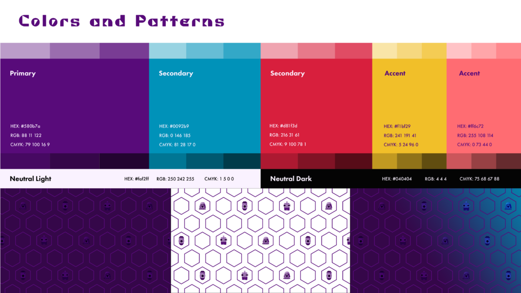
For the colors, I knew I wanted purple to be my main color, and so starting from that, I tried a variety of combinations until I found two secondary and two accent colors that I felt fit well together, and felt appropriate for my brand.
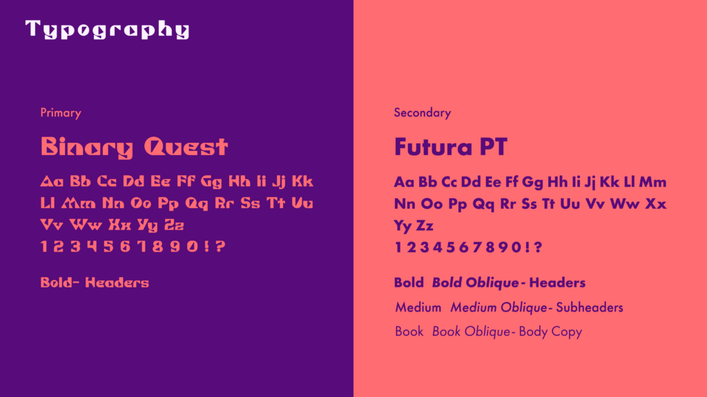
One of the longest parts of this process was deciding on typography. I knew I wanted my main typeface to feel unique and energetic to match the feel I was going for. I started off looking for a more rounded typeface, but as I continued my tests and comparisons, I quickly realized that I needed something more geometric. The rounded fonts felt too silly, I needed something that straddled the line between quirky and mature. After about 8 rounds of narrowing down my options, I eventually landed on Binary Quest, a display font that to me seemed the perfect combination of quirky and technical, and a good match for the robot iconography I’m using. To pair with the expressive main font, I went with the Futura PT family as a way to balance the thick letterforms of Binary Quest.
