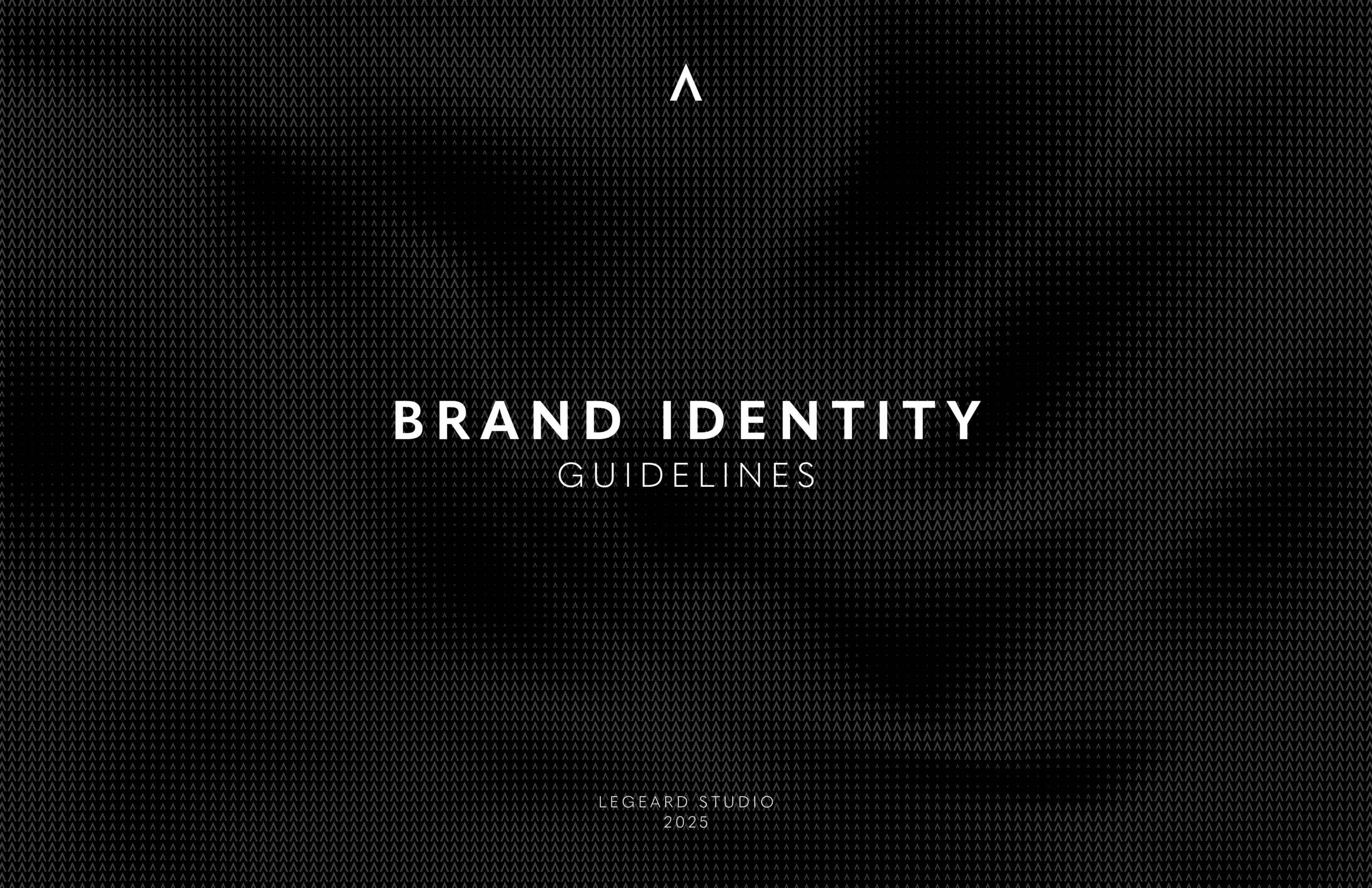
When I started at Legeard Studio, the existing brand guidelines were very loosely defined; the color palette was black, grey, and white, with no HEX codes or RGB/CMYK values, there were multiple unused logo variations, and typography had no set weights or sizes. I decided to work on setting in stone some guidelines for how the brand should present itself. The overall goal was to redefine and solidify Legeard Studio’s brand identity, to create clear guidelines for how to represent the brand through text and graphics, and crafting a document that can be used internally to guide brand consistency, as well as externally for collaborators to use during brand partnerships.
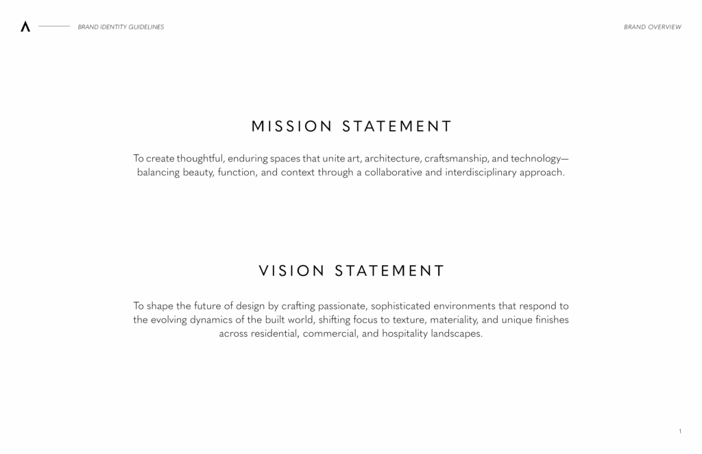
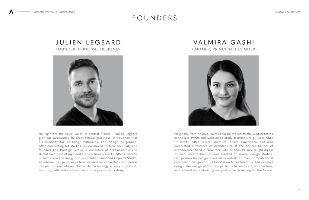
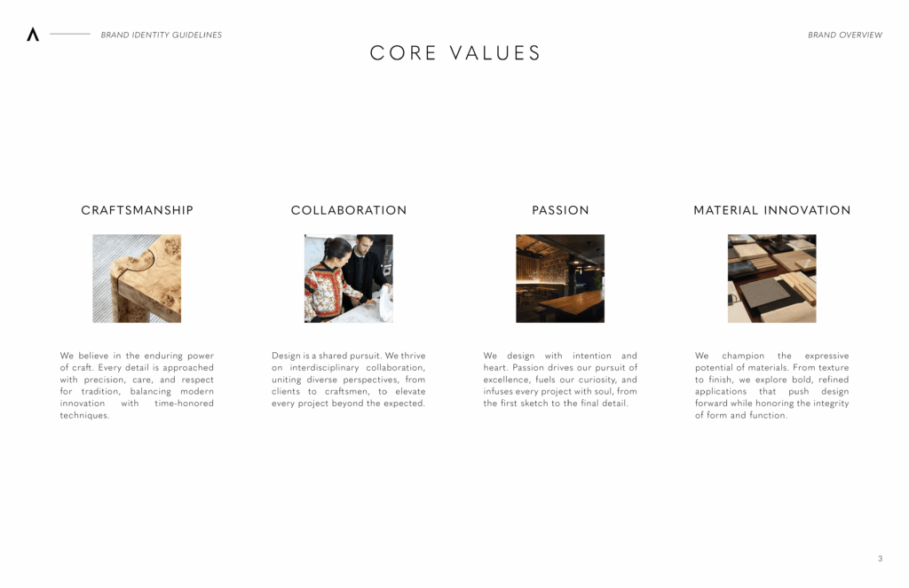
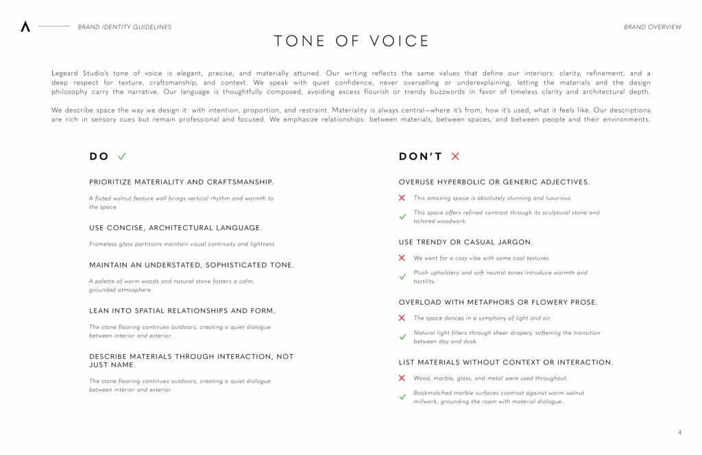
Using previous documents as reference, and with input from the founders, I laid out the mission and vision statements as well as the core values and tone of voice for the company. This was to ensure that all communication from the brand is consistent and aligns with the contemporary and luxurious reputation of Legeard Studio.
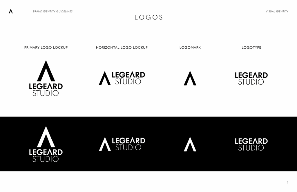
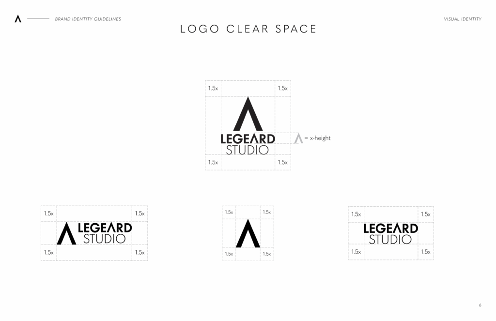
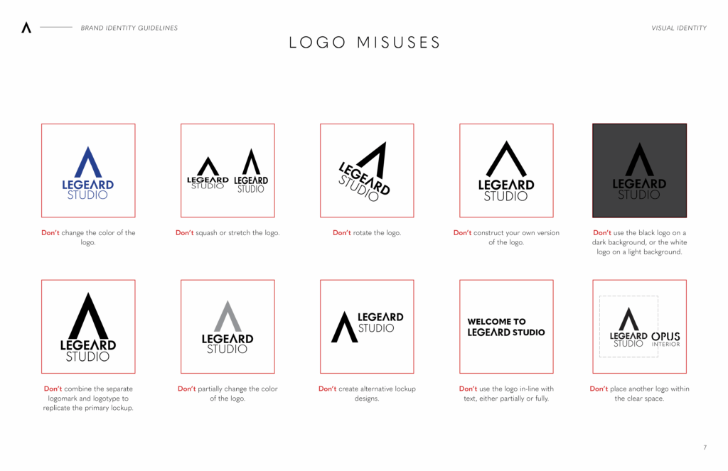
I eliminated unused logo variations, downsizing to a primary lockup, horizontal lockup, logomark, and logotype. I also defined clear space for all variations, so that when the logo is used in context or with co-branding, it does not get too crowded. I clearly defined various common misuses of the logo to ensure it didn’t get distorted or altered.
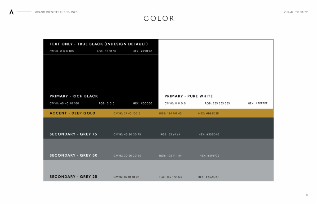
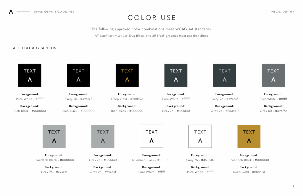
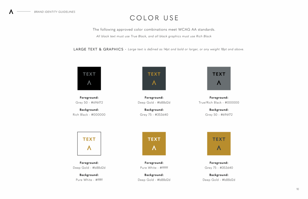
I knew the brand wanted a minimal and luxurious feel, so I kept the color palette to a minimum, using only black and white as the primary colors, three shades of grey as secondary colors, and a deep gold accent color to add warmth. With these settled on, new designs would have enough freedom to create unique compositions with layered color without the color becoming a distraction from the actual content. Once the colors were locked in, I used an online WCAG standards guide to analyze the accessibility of various color combinations. This ensures that any text and graphics are accessible and clear to read for everyone.
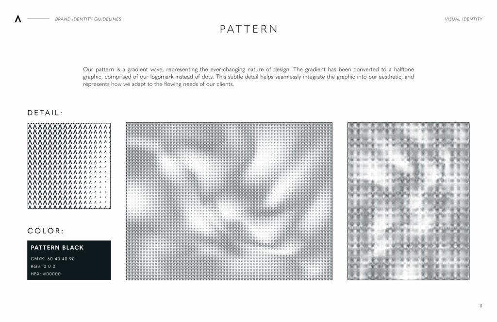
To compliment the new color palette, I designed a custom pattern to use as an accent detail on presentations and graphics. For this, I played around with various gradient mesh designs until I made one I liked, then converted it into a halftone pattern, using the company logomark as the dot. This themed the graphic, making clear it was a custom design and allowing it to seamlessly integrate into Legeard Studio’s visual language.
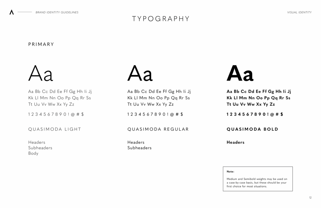
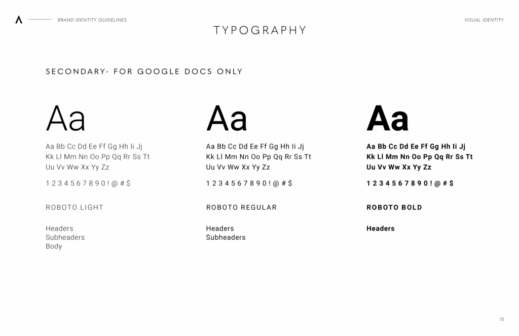
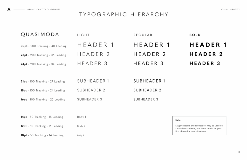
For typography, I created various tests to decide on standardized font sizes. I played with tracking and leading as well, making sure that the text was clear and readable in all situations.
