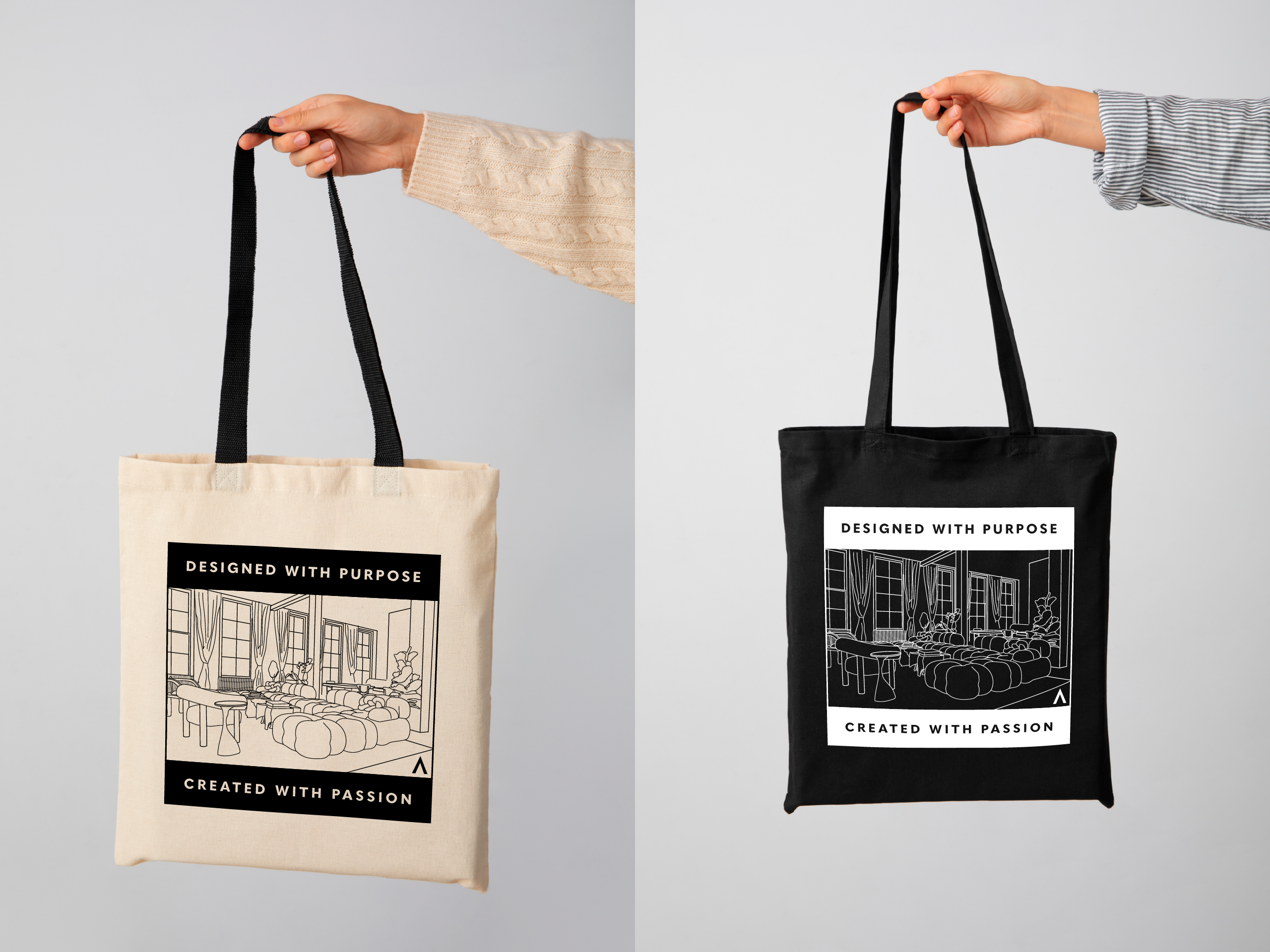
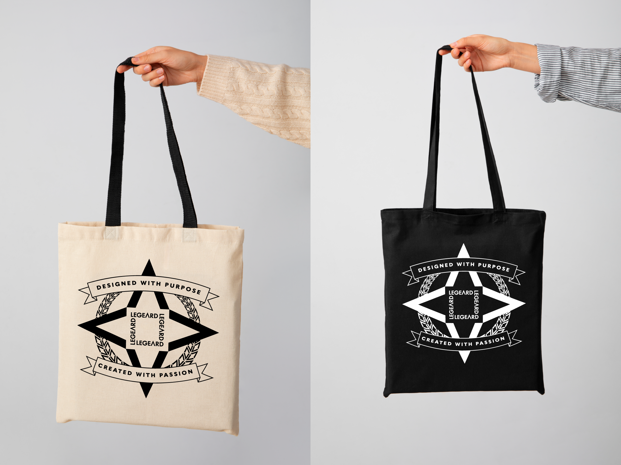
The Challenge: Design a tote bag that can be given to customers upon completion of their project. Go beyond a simple logo on a bag, creating a design people would want to use and display in public.
The Process: For this project, I took inspiration from the “streetwear” style of clothing. I chose this style as it utilizes unique printed graphic designs, emphasizes modern aesthetics, and its more casual feel works well with a tote bag that can be carried for daily use.
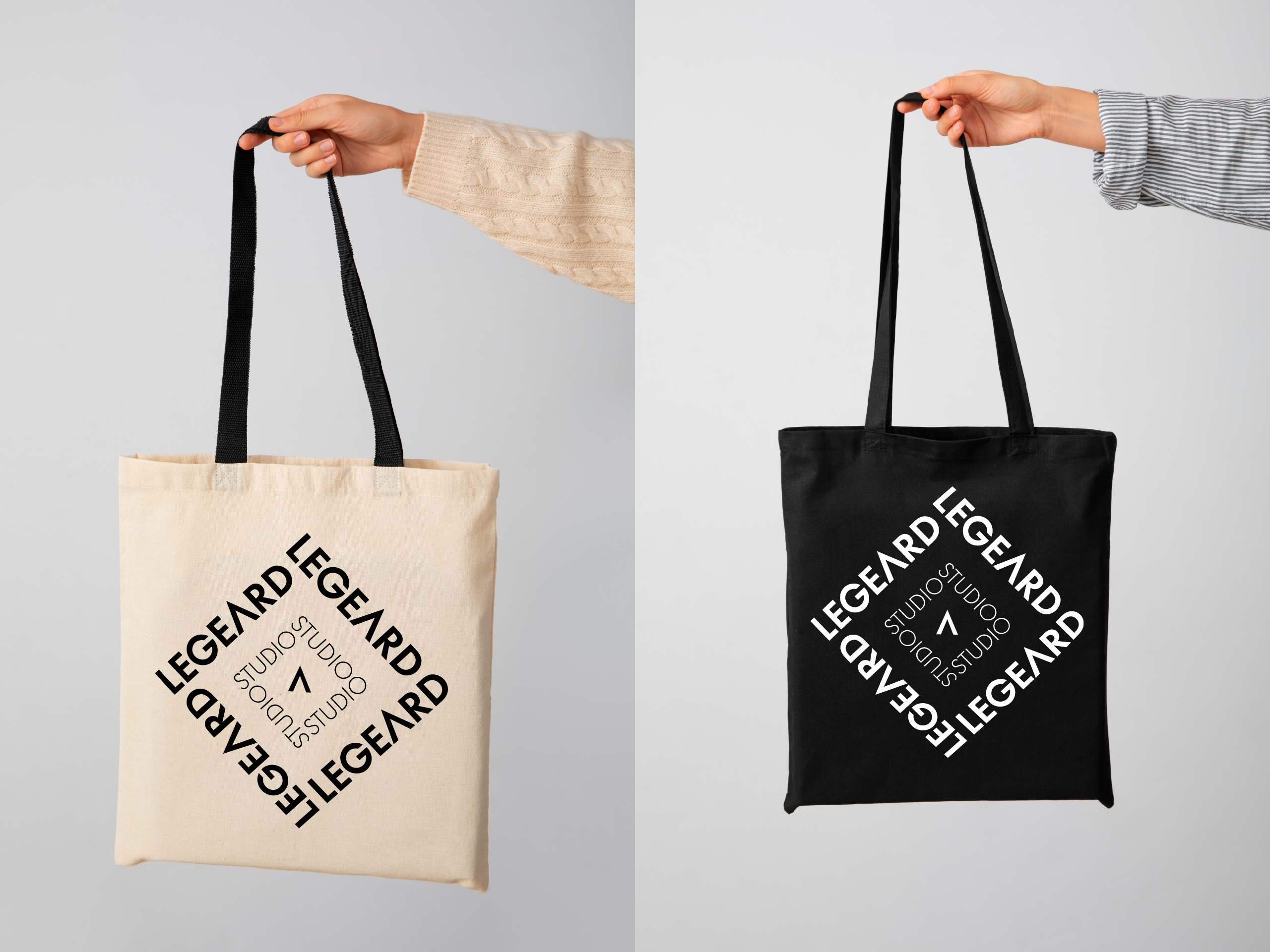
I started by exploring what sort of designs I could make using only the Legeard Studio logo. With the main logomark being an arrow, I felt there was a lot of possibility for unique geometric designs. I started by trying a repeating pattern of the logomark, using the triangle shape to create diamonds and combining outlined and solid color versions of the mark to create visual distinction. In the end, I decided this felt too much like a pattern one might find on an argyle sweater.
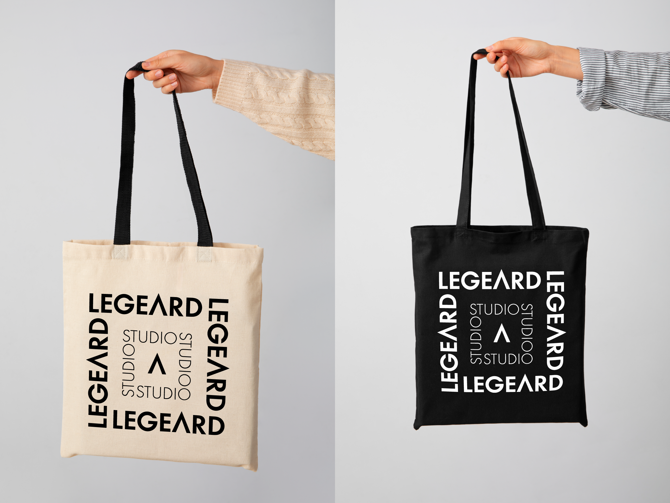
I then pivoted to trying designs of more simple geometric shapes using both the logomark and logotype. I realized I could orient the studio name into a square, with the bolder “Legeard” creating an outer square, and the lighter “Studio” to create an inner square. I then incorporated the logomark in the center to draw focus and complete the look.
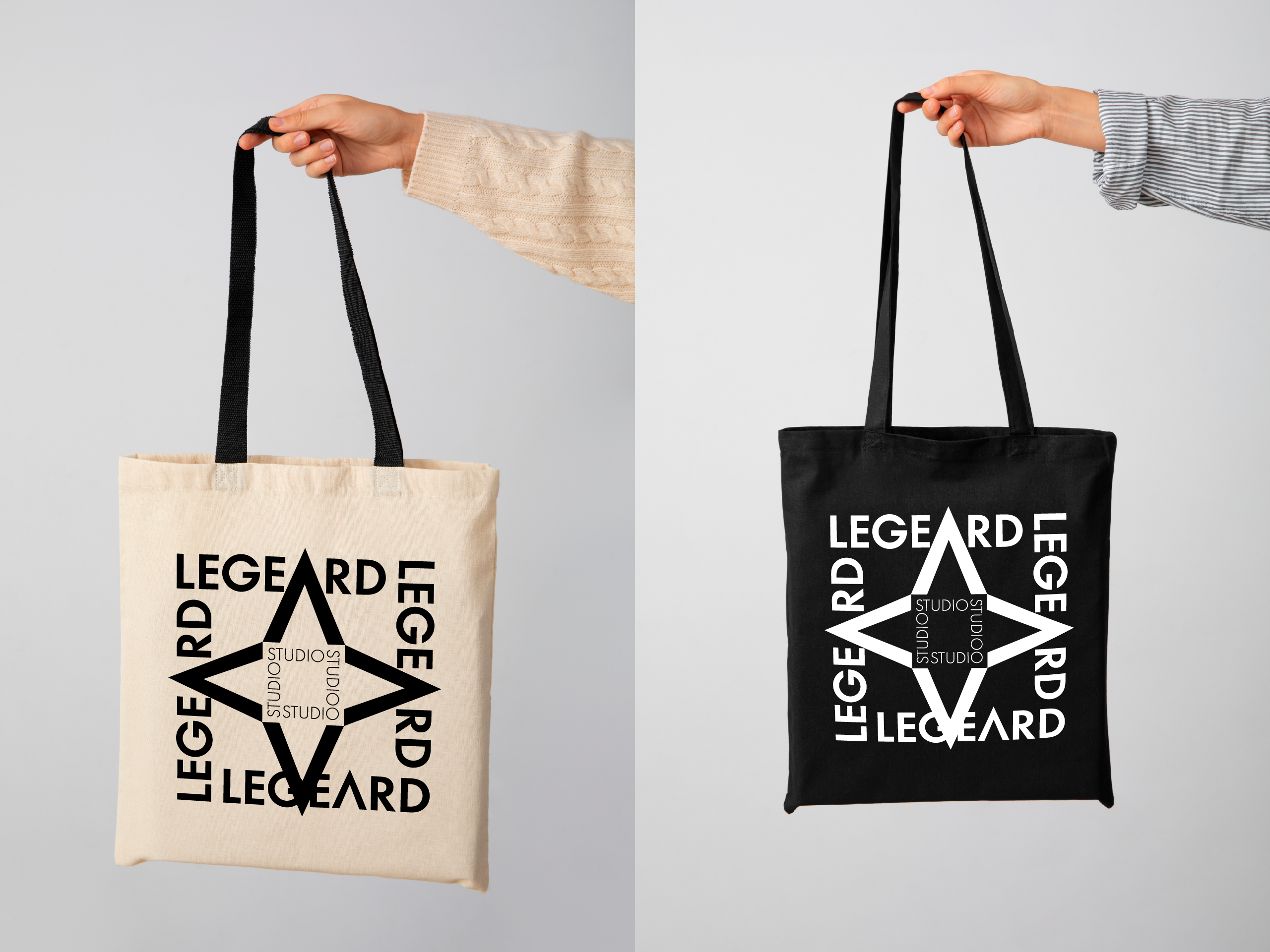
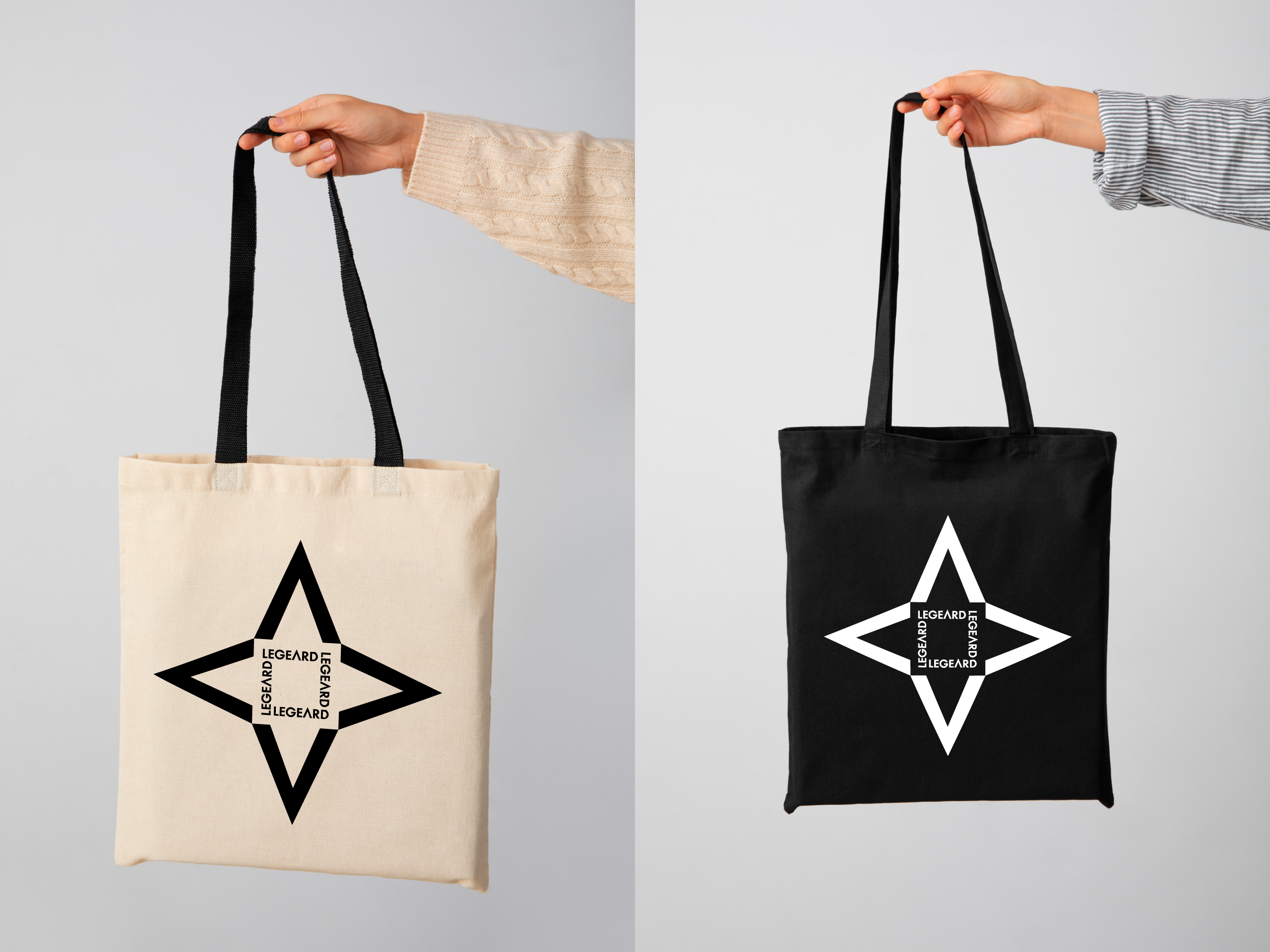
Through further exploration I realized I could use the logomark to make a negative space square by aligning four marks tip-to-tip, turning 90 degrees each time. I then incorporated the previously designed squares, and realized that the tips of the left, right, and top logomarks would overlap with their smaller counterparts in the “Legeard” square. I finished it off by adding the “Studio” square inside the logomarks. This ended up being my favorite design, and the one I felt seemed most like a design you would find on streetwear.
From my first design creating diamonds using two of the logomarks, I discovered if I put two of those diamonds together and then repeated it, I could create a version of a classic laurel. This lead to me creating an alternative of my favorite design, moving the outer “Legeard” square to the center, and using the laurel and a banner with a tagline to encapsulate everything. This design was a bit of a step away from the streetwear style, but I felt it still held merit.
As a final exploration, I thought about how we wanted to give these to our clients upon completion of their interior design. With this in mind, I took a photo from a previously finished residential space and traced it in Illustrator, creating a clean outline design of the photo. My thinking on this was if we wanted our business to expand through word of mouth from our clients, giving them a customized design on something they would actually use in their day-to-day life would increase the chance of them talking us up while showing off their custom bag to their friends. It felt a little bare by itself though, so I incorporated a tagline we had used previously, and placed everything inside an outlined box to bring it together.
This was a fun exercise trying to design something in a new style, focusing on the goal of making something that looked good enough that people would want to actually use it, as opposed to most basic branded merch companies give out.
