This was a logo design project for Techonomy’s 2023 annual Climate Conference. This project started when I was asked to start working on social ads to promote the event. I was familiar with the designs for the event, so before I started making ads, I got permission to completely redesign the logo.
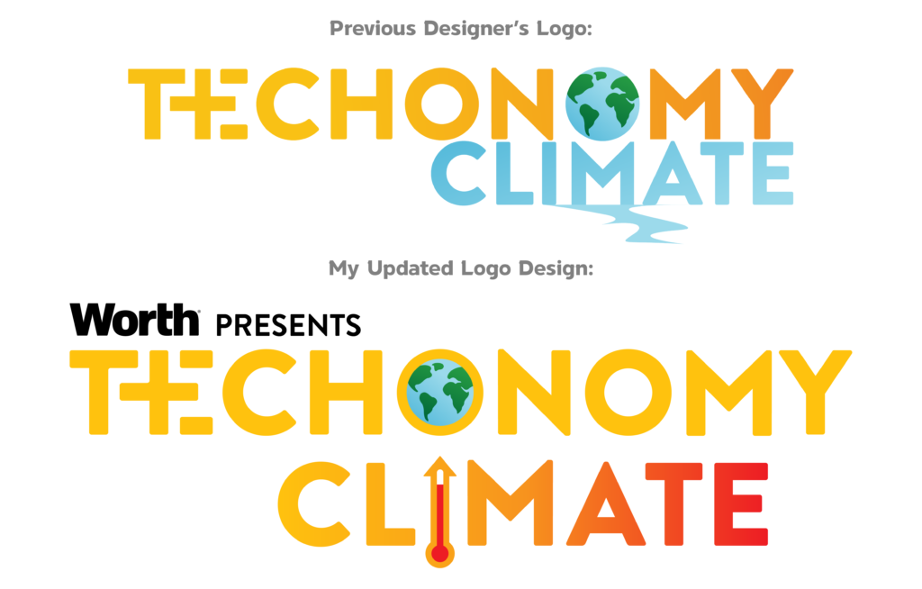
The logo from 2022 was made by the designer previously in my position. Not to disparage the work of the former employee, but I did not feel like this logo design was adequate for an event of this size, nor was it clear what it was representing. I had to ask my manager the meaning behind the logo, and he believed that the trail of blue coming from the “M” in “Climate” was meant to represent melting polar ice, but even he wasn’t entirely sure of this. The concept itself isn’t bad, but the execution does not clearly explain it’s meaning.
From there, I realized that my logo needed to clearly explain the event, and that the graphic elements needed to be immediately identifiable. While melting polar ice caps is a symptom of climate change, it isn’t the main focus. Since the event was going to address varying aspects of climate change I wanted to logo to address the central symptom: increasing global temperature.
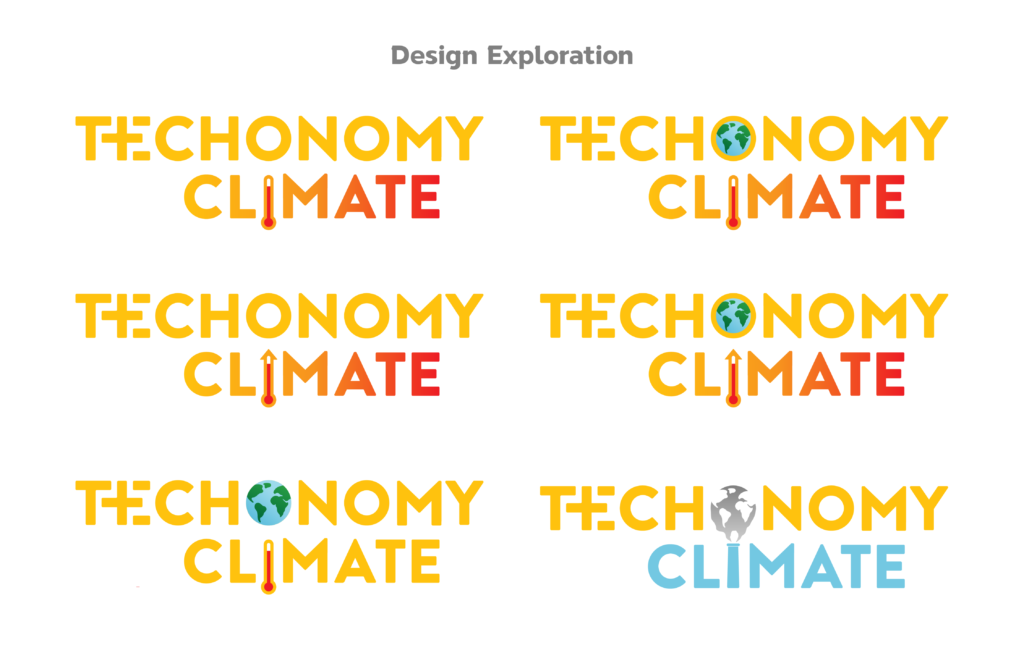
I created several design variations, centered around global temperature increase. I kept the globe graphic in the “O” of Techonomy from the previous design, but reduced the size so that there was a ring of yellow around the earth. This helped keep the feel that Techonomy was one continuous word, and not “Tech” and “Nomy” with an earth graphic between the two. It also doubles as a representation of the higher temperatures being trapped in the atmosphere surrounding earth due to greenhouse gases.
I also incorporated a thermometer as the “I” in Climate, and positioned “Climate” so that the thermometer was directly beneath the globe graphic, to emphasize the temperatures are increasing all over the Earth. The arrow at the top of the thermometer is meant to represent that the temperature is going to continue to rise if we do not address the issue.
In the previous design, having “Climate” be in blue didn’t evoke feelings of temperature increase, but rather the opposite. To remedy this, I filled “Climate” with a gradient going from the Techonomy yellow to red, representing the gradual increase of temperature.
I also wanted to explore a logo design that addressed the cause of global temperature increase: greenhouse gas emissions. For this design, I turned the “I” in “Climate” into a smoke stack, and had the smoke coming out of it form the oceans on the globe graphic, with the negative space acting as the continents. I was especially happy with how I was able to incorporate these into the logo, but it was decided among my colleagues that the thermometer design was more impactful.

